
How To Lose A Logo In 7 Days: A Cracker Barrel Story
Sometimes we all need an Uncle Herschel to show us the way. That’s what Cracker Barrel learned last month when it introduced a redesigned logo, which took away both the literal and figurative character of the original logo and replaced it with a stark slab of letters. What followed was a 7% drop in market value, an avalanche of opinion pieces, and a promise to return to who made them who they are: good ol’ Uncle Herschel.
The Original Logo
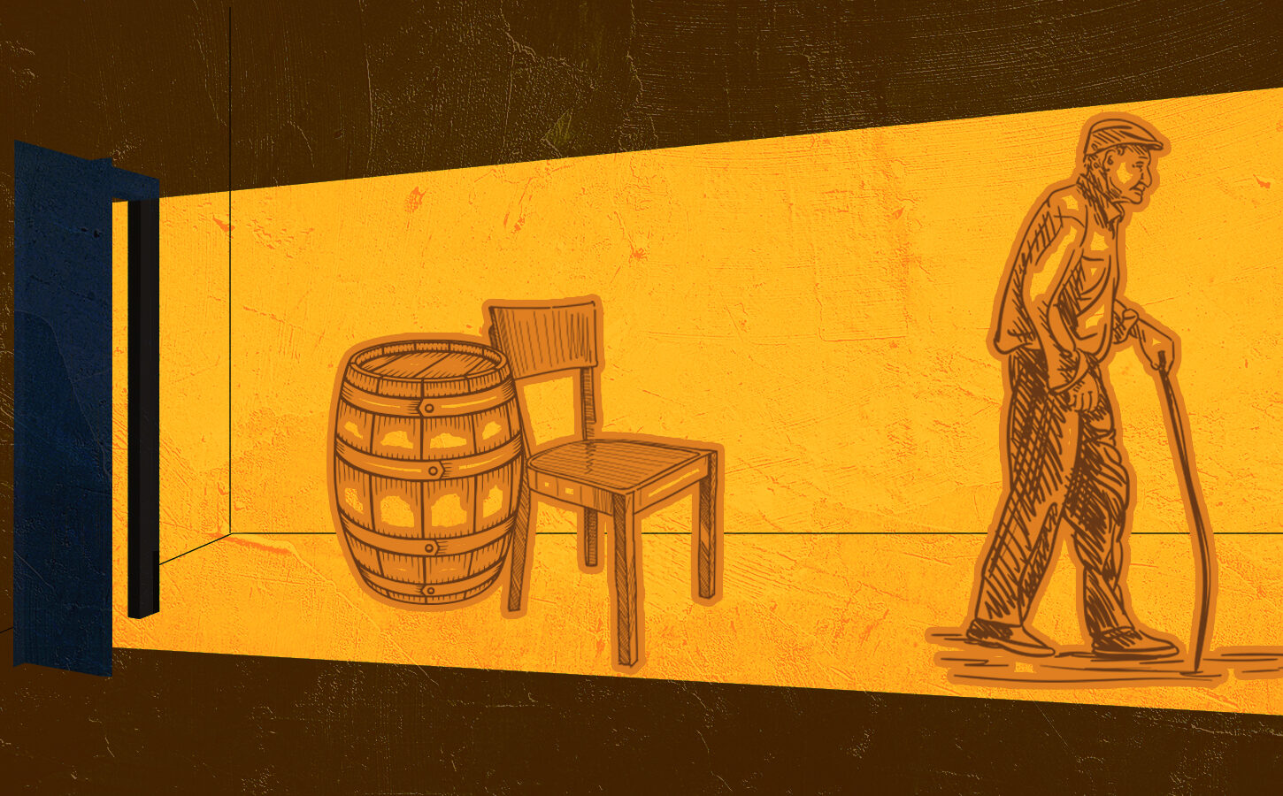
For those that haven’t been to one of its establishments, Cracker Barrel’s identity is deeply entrenched in the idea of southern hospitality. The restaurants have a front porch area, adorned with rocking chairs that serve as “a symbol of community and relaxation”. The Cracker Barrel logo has remained relevantly unchanged for decades. Originally designed by graphic designer Bill Holley, the logo was created “with the goal of creating a feeling of nostalgia with an old-timer wearing overalls”. Consisting of a man who is either the founder’s Uncle Herschel or a man heavily inspired by him (there’s some debate), a wicker chair, and a literal cracker barrel, the company’s logo is the embodiment of cordiality and reminiscence.
A More Basic Look
The full branding guidelines for the (now defunct) redesigned logo are somewhat hard to track down. The negative backlash has mostly subsided, and the original logo has been reinstated. From what I could find, the new look would have completely removed Uncle Herschel, the wicker chair, and the cracker barrel. In its place would have been the company’s name in a similar-as-before font over a shape that aims to loosely resemble a barrel. In my opinion, the shape barely resembles a barrel since it no longer includes the natural curve of a barrel’s sides, replaces the curve with a softened point, flips the container on its side, and removes all notes of visual texture. With the removal of those core elements, the redesigned logo was stripped of its former depth. The design amounted to black text on a yellow blob, taking away all the characteristics that made Cracker Barrel’s look distinct.
What Went Wrong
In pursuit of modernization, Cracker Barrel flipped on its veteran audience and everything that made them unique. Even in the redesigned branding that was previewed, the imagery used lacked emotional depth.
In recent years, there has been a trend in design to simplify and minimalize. For the last decade and a half, countless companies have redesigned their logos to simplify or entirely remove key symbols and graphics (logomarks) and soften text (most of the time transitioning from serif to sans serif fonts). This movement in some ways is rooted in our shift from print to digital consumption. In theory, a minimalist graphic would allow for more legibility, but now companies can get caught up in the trends without considering the impact of doing so.
From a creative perspective, I believe the new logo missed the mark because it almost completely loses the barrel iconography. While much of the backlash might seem to have been around dropping the Uncle Herschel figure, I’m of the opinion that the new design could have worked if it did more to maintain the core design element of the barrel. It’s important to note that nearly all logo redesigns face negative backlash in some shape or form. It’s our human nature to resist change, so a new logo is always going to have some blowback. Nevertheless, had the new design utilized a more definitive barrel shape and added some dimensionality, creating patterns and a visual system built on the iconic cracker barrel, I think it could have survived the backlash and gone on as their new standard.
Another option would have been to remove the barrel but kept the Uncle Herschel figure, simply redesigning and refining the art used for his likeness. Cracker Barrel might have developed a full creative suite built around the Uncle figure, perhaps including new characters to reflect the modern-day audience in addition to Herschel.
To summarize, they could have removed one element or the other, but not both. By removing both, the logo sends an unintended message. Cracker Barrel’s loyal customers see themselves in the original design elements. By discarding Uncle Herschel and the barrel, it takes away from the connection that the audience has built with the business.
A fundamental rule to follow for any redesign is honoring your history and remembering your audience. Never design something new just for the sake of it. A redesign should be both emblematic of your past and reflective of your future. Creative assets are not just about the visuals themselves, but what they repre