The 2023 Philadelphia mayoral primary is on Tuesday, May 16. It’s a stacked field, with nine Democrats and David Oh as the sole Republican candidate on the ballot, all vying to be Philly’s 100th mayor.
The Ceisler Media Digital & Creative Services team is here, not to weigh in on contenders’ chances on winning or to analyze the close race – Larry Ceisler and Bellevue Strategies CEO Rashed Mustafa discussed that last month.
No, in this blog, Ceisler Media’s creative team analyzes Philly mayoral candidates’ logos.
Why this core component of a candidate’s campaign? Logos carry a lot of weight; it’s the most recognizable representation of a company, brand, or individual. Ceisler Media itself unveiled a logo rebrand in 2018.
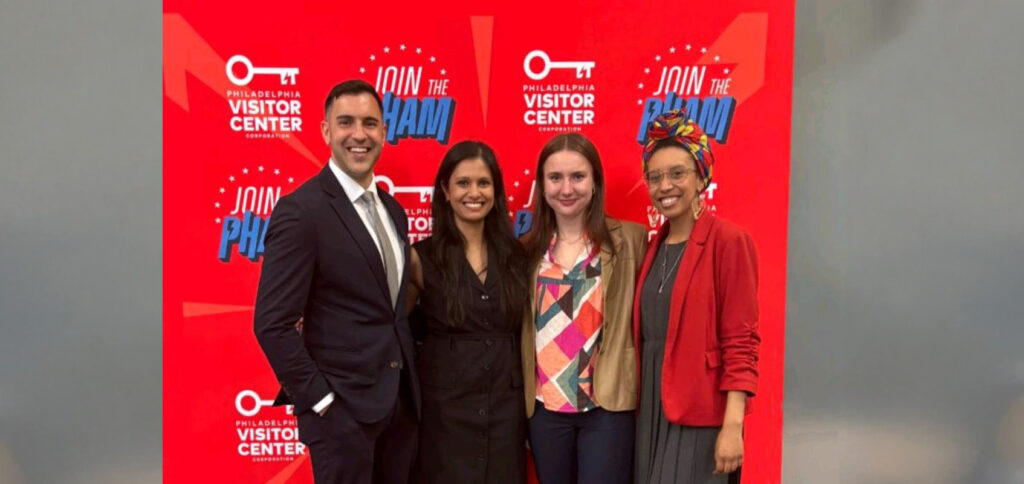
Let’s introduce the team in alphabetic order by last name:
Kenneth Hilario, Director of Content Strategy
Keanu Ibarrondo, Senior Creative Manager
Ally Roshannon, Digital Content Associate
Samra Smajlovic, Creative Manager
Shannon Wink, Senior Director of Digital Strategy
Let’s get started! Candidates are listed by alphabetical order by last name.
Warren Bloom

Kenneth: We couldn’t find a logo for Bloom, but this is what’s available on the campaign’s website. I would have chosen just one image, especially since the images used here are the same or very similar. I would also have developed a single logo/visual identity that can be used across platforms and mediums (digital media and traditional media like pamphlets).
Keanu: There is so much going on here, it’s distressing. I think I’d rather see another Liberty Bell.
Ally: That’s a lot of headshots… One would’ve been sufficient to leave room for all the text and information he wanted to highlight. Still better than the one candidate with nothing, but I can’t tell if he’s running for mayor or trying to secure a Men’s Warehouse job.
Samra: The images are dominating the text here when the text is what is important. I don’t really know what I’m looking at.
Shannon: Something is better than nothing as Delscia Gray demonstrates (see below). There’s far too much going on here, but maybe he’ll get a modeling gig with this headshot card.
Amen Brown

Kenneth: Bold fonts always get bonus points from me, and I absolutely love the juxtaposition of full text and outline fonts (“Amen” is in full text and “Brown” is an outline font). I’m torn. I like the stark contrast of black and white, but I’d like to see it in different colors and see what that does to it. It’s pretty cut-and-dried as it is, color wise.
Keanu: Smart move using a bold, filled in font alongside an outline to highlight the fact that this is “Amen” Brown and not the other Brown. Maybe unintentional, but the emphasis on “Amen” with the filled in text and larger size makes me want to pray for this mayoral race. The lack of color, while not inoffensive, does make it feel a little cold. Still, this logo is simple and gets the point across.
Ally: It’s bold and to the point, but a little color could’ve gone a long way. I do like the font choices and design overall.
Samra: This is giving me Star Wars vibes, so I don’t know how to feel about it. I do like the fact that it’s black and white because it stands out from the other candidates. However, maybe including one other color could have changed the look a bit. It’s still a nice and clean logo.
Shannon: I want to like the simplicity and the font contrast with the outline but the black and white isn’t doing it for me. Unlike many of the other logos, this one works really well within the juxtaposition of the campaign website, but the standalone logo doesn’t catch my eye enough.
Jeff Brown

Kenneth: It gets the job done, I suppose, but it’s safe and forgettable. Again, it uses both serif and sans serif fonts, so there’s some sort of differentiation between elements. However, I will say orange and black together will always give me Halloween vibes. I’d like for Philadelphians (individuals, businesses, brands) to use anything other than the Liberty Bell, though.
Keanu: Did I mention that Philadelphia has the Liberty Bell and only the Liberty Bell? Because that’s all it has according to these logos. Jeff’s logo tries to pull off what Amen’s did, highlighting which Brown this is, but doesn’t stick the landing. The shade of orange is muddy and uninviting, while the change in weight from “For” to “Mayor” is unnecessary. The lines beside the text also seem to be different weights between the top and bottom, which feels almost arbitrary.
Ally: This feels very dated to me, and I don’t love the color choices. It’s not the worst design I’ve ever seen, but it’s not memorable or noteworthy in any way.
Samra: Not crazy about the color combination, however, the mixing of serif and sans serif font does look great. With how the logo is laid out, an image of a building in Philly could have worked a lot better instead of the classic Liberty Bell.
Shannon: More Liberty Bell. Again, I get it, but it’s tired, and the brown and orange combo isn’t doing the brand any favors. In this case, because there are multiple candidates with the last name Brown, it’s a bad idea to make that the focus of the logo.
Jimmy Deleon

Kenneth: It gets the point across – Deleon’s running for mayor of Philadelphia, and you can see the skyline. I wish it had at least one pop of color and that it had the most recent Philly skyline. I always try to spot the Comcast Technology Center to see if someone is using the current skyline.
Keanu: Cold and structural; this logo does not have much going on for it. No color and bland type choices along with a stock, clip art skyline that doesn’t feel very Philadelphian.
Ally: It’s different than other mayoral logos with the skyline and black/grey color scheme, but I’m not sure that it stands out in the right way. It wouldn’t really catch my eye as a political sign because I’d think it was a construction company logo at first glance. I also would’ve made the text flush with the edge of the skyline on both sides.
Samra: Very plain. No color or creative type choices make this logo a bit boring. There are a lot of other ways to represent Philadelphia besides the skyline so this one doesn’t have any attention-grabbing characteristics to it.
Shannon: I get personal injury lawyer vibes from this one. I really like the skyline image, but the overall lack of color makes this easy to overlook.
Allan Domb

Kenneth: Simple. Effective. I particularly like the font used for “Allan Domb.” I like that it’s a serif font but a soft one, so it’s not so severe. I might be getting existential and overthinking what fonts say about someone, but if I didn’t know anything about this candidate, the font tells me this person is firm and self-assured but understanding. Edited to add after reading everyone else’s response: What’s with all the orange in logos?
Keanu: I have to give credit to Allan for using a Serif font better than his rival. The beginning is serif with a subdued, deep blue, telling me he’ll take a more traditional road if elected. The splash of orange in “Domb” ensures it’s not too traditional or subdued though and makes sure I remember the name when it comes time to vote. Very simple and effective. My favorite shade of orange amongst the three.
Ally: I don’t love the color combo, but it’s better than some of the others. The fonts work together.
Samra: This is very plain and simple. The colors and fonts work well together, but there isn’t much going on. There isn’t much of a personality standing out in the logo, but that could be intentional.
Shannon: Clear and simple, and I appreciate that he avoided the Liberty Bell. The blue/orange combo is still not working for me, but this orange is the least offensive of all the campaigns using that color.
Delscia Gray
Kenneth: It’s a shame we couldn’t find a website or logo for Gray. It makes it hard to keep a candidate top of mind or tie anything to them.
Keanu: No comment from me to match the missing website and logo from Gray.
Ally: Easily forgettable due to a lack of digital presence and branded assets
Samra: Logos are incredibly important when creating an identity for individuals to see and follow! Not having some sort of identity and online presence makes it difficult for anyone to learn more.
Shannon: The lack of visual presence or digital strategy is the mark of an un-serious candidate.
Helen Gym

Kenneth: This is what I’m talking about! For me, this is the boldest and memorable of all the logos. The outline font with the shadow coming out at an angle, but it’s elongated. *Chefs kiss* It reminds me of the reaction had I when I saw AOC’s marketing and visual identity. If I knew nothing about this candidate and only saw this branding, I would think, “This person wants to get stuff done.”
Keanu: Regardless of your opinion on Gym, she’s got style. The font choice and blue extrusion behind her name screams “unique” while exuding a bold energy you hope will be carried into office. The type choice is brilliant, straying the line between traditional and modern thanks to its subtle contrast. This logo is the most branded of them all, take that how you will. Just a lovely logo all around.
Ally: This is one of the best. It’s a clean design while still being bold with the color choices.
Samra: Absolutely love this one. It’s bold and in your face which is important to get an audience’s attention. Whether you like the candidate or not, your eye is drawn to the type and contrasting color scheme.
Shannon: This logo has energy. The deep blue color could be a little boring but the extrusion on the name livens it up. This is bold enough to attract new and young voters, but not outlandish in a way that alienates skeptics.
David Oh

Kenneth: Two Liberty Bells don’t make it right. I like that Oh’s slogan is integrated into the branding, but it’s throwing me off that “Mayor” is just slightly smaller than “David Oh” in size. I would have made it either the same size at this point or made it half the size for contrast.
Keanu: The Liberty Bell, a landmark so nice you use it twice. The only way to one-up a rival’s use of the icon is to use it more than once. The overall design is textbook Vote For Me lawn material, so I suppose Oh will take a textbook political approach if elected to office. “Mayor” is practically the same size as “David Oh,” which is a hierarchical no-no but maybe, just maybe, it was done on purpose. It almost reads as if Oh is already mayor.
Ally: There’s a lot to unpack here. The Liberty Bells add something to break up the large text up top, but not in a good way. I like that they tried to incorporate a slogan, but I can’t fully appreciate it because I keep looking at the bells. I also second Shannon’s point about the period at the end of the slogan.
Samra: This looks like a stereotypical lawn sign that you see every day. I think he could have gotten more creative with the font choices so there was some kind of hierarchy. However, I do like the slogan being included.
Shannon: Two Liberty Bells, I see. I strongly dislike the period at the end of the slogan; it feels aggressive and unnecessary and it’s all I can focus on.
Cherelle Parker

Kenneth: In a sea of more neutral and subdued colors across the mayoral candidate field’s visual identities, Parker’s stands out simply because of the bold orange. Nice, but too obvious, nod to Philly with the Liberty Bell.
Keanu: Clean and inoffensive, the flair on the letter C adds a subtle uniqueness that helps it stand out (if only a little). Interesting color combination that makes me feel like she is trying to distance herself from traditional bi-partisan discussion. Her orange is better than Jeff’s but not as nice as Alan’s.
Samra: Her logo is simple but effective. The font used isn’t your average everyday used one, combined with the bright color choices. I think it stands out nicely and it’s not too in your face.
Ally: The colors aren’t my personal favorite, but it’s a nice logo overall. Clean text that gets the point across with the Liberty Bell replacing any mention of Philly specifically.
Shannon: The orange stands out, which is an overall positive. It’s personally not a color I like, so that’s a risk the campaign takes with voters. The Liberty Bell appears in a lot of campaigns, and I understand why because it’s iconic, but that also means it’s overdone.
Rebecca Rhynhart

Kenneth: I like the color choices that were made, including having the Liberty Bell (again, a too-obvious nod to Philly) and “Rhynhart” the same shade of blue. I always appreciate a mix of serif and sans serif fonts – mixing fonts that are too similar make it hard to differentiate between design elements.
Keanu: Ah the Liberty Bell, aka the only landmark in Philadelphia. Placement of the various assets making up the logo are clean. The logo adds something to the field with its mixture of serif and san serif font, but then loses it immediately by adding the varied weights in “Rebecca” and “Rhynhart.” The color change between the first and last name do not help either. I do like the shade of blue chosen, however, as it gets the point of Democratic candidate across while feeling a little more unique.
Ally: The colors and overall feel are effective, but there’s a bit too much variation in the text between the changing weights, colors and fonts. It could’ve been simplified for a cleaner look, but I like it!
Samra: Love the colors used here, it makes her logo and name stand out a bit compared to the other candidates. The mix of serif and sans serif is great, but the name should have stayed one weight since there already is a contrast with the changing color.
Shannon: I like this blue much more than the dark blue that comes up in other campaigns, and I think it’s smart to play up the last name because that’s ultimately how voters interact with the ballot. Overall, too many font treatments make what could be a clean logo feel overly complicated.


