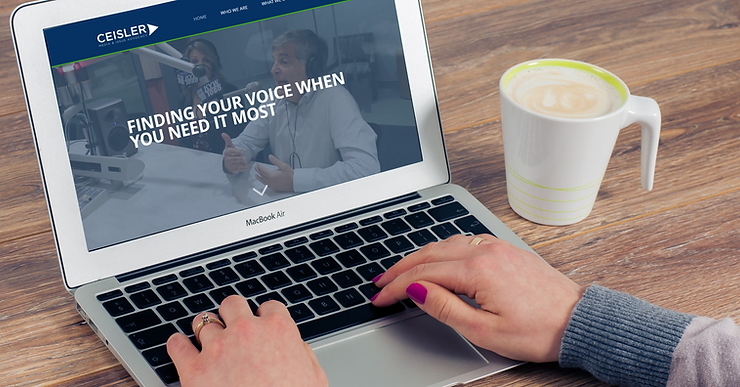
If you are a friend of Ceisler Media, you may have noticed our sleek new logo and website design. We help our clients build their reputations and maintain their images, but rebranding ourselves was different.
As a communications firm, our thoughts are always on our clients and what we can do for them. We are always focused on our clients’ reputations, their social media presence and their websites. We are so embedded in work for our clients that we sometimes forget to follow our own advice.
We decided back in the spring that it was time to give our brand a little self-love and the same thorough treatment that we offer our clients. Here’s some insight into our process and what we’ve been working on for the past six months:
We designed a new logo.

We wanted all of our branded materials to have a consistent look and and clean and modern feel. The type of work we produce has evolved greatly in this new digital era and we wanted our new materials to reflect that.
We formed a small subcommittee to tackle our rebranding projects. There were five of us in the room debating color choices, fonts and overall look and feel. Since there were only a few of us, we were able to openly discuss our ideas and concerns without dragging out the process.
When it came to our logo design, however, there was one clear choice for who would lead the creative process. Our Multimedia Designer Will Jara spent hours sketching ideas and refining the logo design. Our little task force provided input on what we preferred, but we followed Will’s vision and insight into the design process. Our trust in him and commitment to keeping the review process small was essential for us to end up with a design we loved while adhering to our project timeline.
Stay tuned for more insight into Will’s design process in the coming weeks.
We reviewed our messaging and how we present ourselves to the world.
Just as we would review and develop messaging for our clients, we did the same for ourselves. Over the past several years, we have incorporated new strategies and services into the communications plans we develop for our clients. Our own new messaging needed to reflect our ability to adapt to our client’s needs as well as our expanded capabilities.
Even though we help our clients with messaging every day, it can be challenging to look inward and decide how best to talk about ourselves and our work. This is why many of our clients come to us, looking for outside help and fresh ideas. For us, Senior Consultant Glen Macnow was instrumental in helping us through this introspective process.
Glen often serves as our editor and reviews our work for our clients. He does the same for our blog, asking us all the right questions to ensure our work is the best that it can be.
Glen reviewed every piece of copy on our website to ensure we were speaking with a clear and consistent voice on every page. In addition, every staff member’s bio and every case study was written and reviewed by multiple members of our team.
Others pitched in as well. Over a few rounds of beer on a late-summer night, more than a dozen Ceisler associates tossed around messaging ideas and slogans. You’ll see read the results of their bull session while scrolling through the revamped site.
We designed a new website.
A website is a living, breathing presentation of us to the world. It’s both a creative process and a technical one. I spent the last few months building, designing and curating with help from other members of our team.
I had a lot of the building blocks from our previous work when I started creating our new branding guidelines and developing the written content. These pieces were the foundation from the site, but I still received many other pieces of content — such as photos and videos — as the site was being constructed.
I normally spend my time building websites for clients. So I enjoyed the opportunity to use our Ceisler Media website as my web design playground. Every creative needs her own project from time to time, and our team took advantage of the space to test out ideas as they came to mind. This website brought our team together as we experimented and shared our thoughts with each other about what this new website could become.
There were some ideas that we tried while we were building the website that did not pan out, and many that created hurdles we needed to overcome with creative solutions. It was worth every minute that we spent testing and trying new techniques to end up with the site that you see today.
We updated our business cards, letterhead, social media pages, and everything else that represents Ceisler Media to the outside world.
The Ceisler Media brand is represented in so many different places and all of those had to show a consistent visual representation of who we are. We took an inventory of every detail that would need to be updated so that we would be ready to unveil our new brand across a multitude of platforms. We also wanted to make sure our staff would have the resources they needed in one easy to access location so no one would need to resort to creating his or her own materials.
For the sake of consistency, we made sure that Will Jara, who created our brand guidelines, oversaw the creation of all of these additional resources to ensure that everything would look and feel like our new brand.
We set internal goals for maintaining a living, breathing brand.
This isn’t a once-and-done project. We made a commitment to tell a visual story about our work through photos and video, and we continue to document our new work through case studies and blog posts. As we continue to create new content and live by these new standards we have set for ourselves, we hope that you will follow along.
Elizabeth Stoner is the Creative Services Manager at Ceisler Media & Issue Advocacy.


